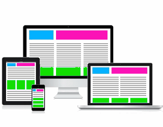
 Given the ever growing variety of devices used to view web pages, it has become increasingly important that sites provide optimal viewing and functionality on any size screen.
To combat constant scrolling, squinting to view tiny text or even abandoning a site that will not function on mobile devices; some have gone so far as to have multiple sites built for each type of device. This expensive fix is also a temporary one as hardware manufacturers keep turning out more and varied devices.
The smarter and more cost-effective solution is responsive design.
With responsive design - whether a site is viewed on a desktop, laptop, tablet or smartphone - the layout of its pages will adjust automatically to fit properly in the viewing area.
This type of design also includes a responsive menu that, on smaller screens/browser windows, will convert from the standard horizontal layout to a mobile-friendly menu icon that produces a vertical menu on demand.
The website you're viewing now has been responsively designed so you can resize the browser window on your desktop/laptop, switch the orientation on your tablet or smartphone, even switch devices entirely and watch the pages adapt to provide that optimal viewing and functionality.
Responsive design technology is available to clients purchasing a new site or those interested in upgrading an existing site. Get more information now.